Tuesday, December 9, 2008

Daily Deviation!

http://lh3.ggpht.com/_Ne-oqK-ynlg/SuHteEzZ1oI/AAAAAAAAAGw/G2k0CIgIWXw/DDblog.jpg

deviantART has what we call: Daily Deviation!

from the FAQ #61 of deviantART
"The Daily Deviation is a daily feature chosen from the galleries here on deviantART.
A small assortment of submissions are chosen each day by a select group of staff/volunteer members who wish to showcase an image which they found impressive or otherwise interesting enough to deserve being brought to the attention of the community-at-large.
The staff/volunteer members responsible for selecting submissions for the daily feature often are open to suggestions and individual community members may direct their attention by noting the appropriate gallery moderator or staff member with a direct link to the deviation which you are suggesting and a brief description about why you think the work in question should be featured."

I have an art gallery in deviantART since Dec 21, 2004
but never had a Daily Deviation!
It means a lot to me!
When I was checking my email, I usually check my updates in
Google Reader and then my message center in deviantART...
I had more than 100 comments and 1500 favs!
it's so awesome!


http://lh4.ggpht.com/_Ne-oqK-ynlg/SuHteKGKmSI/AAAAAAAAAG0/UTk2ErTRXTE/DDgall.jpg

the DD says:

"Daily Deviation, 2008-12-09


The suggester wrote; Skin Color + Swatches by
*DeviantNep are an amazing resource that can
help many artists by aiding them to learn how
to work with various color shades with the guidance
of Swatches. I like to think of these as the digital
artist's the best friend.
(Suggested by =Derzorvadur and Featured by ^znow-white)"


Thank you =Derzorvadur and ^znow-white
for suggesting and featuring it for the Daily Deviation!

Thanks everyone for all the :+fav: favs and comments!

I tried to make it easy and simple to pick colors for skin painting in Photoshop,
and because there are some people out there that use
other programs, I also included in the .zip file,
the preview image, where they can color pick...

I am really glad it helps a lot of people!

this made me really happy!


download
--
in the gallery


Friday, October 3, 2008

Color - Traditional to Digital

The colors squeezed from the paint tube aren't that different from the basic colors you find in a Photoshop swatch. Today many people start digital painting in Photoshop without having any experience with traditional media, such as oil painting or acrylic, but the color concept is the same. If you are a traditional media artist you will understand how digital colors work and if you are a digital artist, you will understand where they come from.

In painting: oil, acrylic and digital, the 2 things you should know before anything else is the color wheel and the value scale, as well as complementary colors. If you understand them, you will know how to chose, mix and blend your colors. The only difference is that oil/acrylic paints usually have a name, and the names are mainly universal; and in Photoshop they have different names, but they are there.

The colors are laid out in an even value gradation already, and in real life we can't have that unless you mix them. The value gradation or scale of the colors in Photoshop is diluted with black and white, which is mostly seen in Hue, Saturation and Brightness. The value gradation of the swatch has the white diluted colors first and becomes darker in a cycle until the darker values.


There are some colors that are basic for oil painting, to mix and blend all the others, such as: burned and raw sienna, cadmium red, cadmium/ochre yellow, permanent, chrome oxide and sap green, cerulian and untramarine blue, alizariam crimson, burnt and raw umber and payne's grey. The basic Photshop swatch, the one you see when you open Photoshop for the first time, or when you click reset swatches, has all of those colors. Raw and burnt umber, as well as the payne's grey are very diluted in white, but you can still see them.

Inside the swatch you can see the real colors


The ideal raw umber, burnt umber and payne's gray would have to look like the ones below if you want to get as closer as possible of the traditional media color, like oil paint.


Mixing the colors in the real world is different than mixing it in Photoshop. Physically, when we add layers of colors on top of each other, more light is absorbed and the color gets darker (browns and blacks). Digitally, because the monitor and the pixels emit light, they show less color, and because of that, digitally, too much color is too much light, or too bright (clears and whites).

Ideally, when creating digital art, all the adjustments on your work should be done very carefully at the end. This is a very hard thing to do but every time you adjust the image you lose color information, and you end up with an ugly purple hue around the edges of the subjects in your work. If you mess around too much with the same work of art you lose too much color. A way to fix this problem is to use adjustments layers, to avoid adjusting the image at the layer with the color.

Another important thing to know is how some colors behave digitally, such as: black, brown, green and dark blue. The digital black is "cool" because it is a true black, not like with oil paint, where the artist almost never uses real black, but uses a mix of ultramarine blue and burnt umber with different values for a warmer or cooler black. Whenever you blend images in Photoshop or mess around with contrast, you are adding more black and white to your work, and you end up losing color. Trying to do that at the end of your work or using adjustments layers is also good in this case. The digital pure brown is pretty much useless and really ugly. Mixing it with other colors to lay in tone and values works better. Digital green is stronger than real green. Adding red to it (works better in an adjustment layer) makes it less bright. Digital dark blue is very hard to blend with other colors. The best thing to do in this case is to either use a clearer blue or apply it on a different layer. Different digital brush sizes, shapes, opacity and flow blend colors differently.

I hope this little article helps some of you understand digital color, and maybe adventure in traditional media, which is also very cool.

Make sure you check this website! because it helps me a lot when I need to figure out a color swatch of digital art and traditional media too!

You can see this article in my gallery, and at dA news.

Sunday, February 24, 2008

Line

Line, the extension of a point, is the primary means of visual communication and the basis of the language of visual experience for recording and symbolizing ideas, observations and feelings. It can be expressed in pure and complex visual forms and in writing.
The pure geometric line is a mental concept, with only one dimension and length but such geometric lines do not exist in the three dimensional world. Line in art and in nature are linear forms in which length dominates over width, physical and imaginary edges that define form, shape and space, as paths of action, recoding the energy left by moving points.

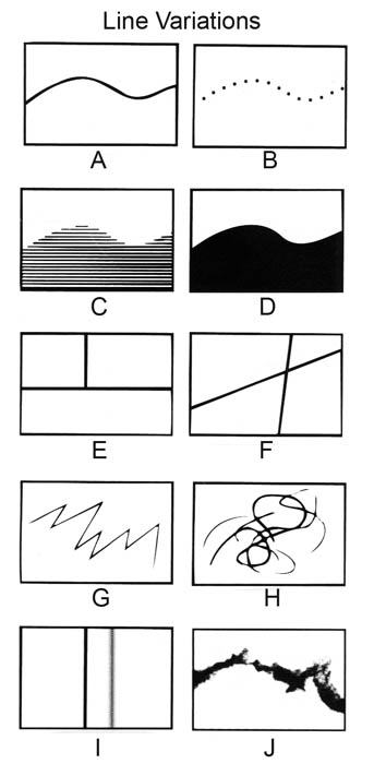
Lines can cause different mental impacts according to their variations and use. They can be active or static, aggressive or passive, sensual or mechanical, indicate directions, define boundaries of shapes and spaces, imply volume or solid masses and suggest motion or emotion, as well as create light and shadow and form textures and patterns.


Actual Line (fig A) - the pure line, used in writing, and in visual arts as contour, creating pure shapes, form and spaces. The Line art First try by Dmaster35 (fig A1) is the best example of a pure line creating form and shape in a simple way, and Line art by Xaomi (fig A2) shows how a line creates shapes and form in specific spaces using contour. Contour is often used in painting, when the artist first draws the basic elements of the painting in paper, then by laying graphite paper beneath the drawing he transfers it to the canvas, using contour.

A1 A2


Implied Line
(fig B) - suggest visual connections, it is the line that is not there; they form geometric shapes or give away the infinity of a line, creating organizational structure. A good example of an implied line is the direction of the look of a model in a photography, like in Ache and Expressions of loneliness (fig B 1 & 2) by me. They can also imply curves and constrast (fig C) like in Vortex (fig B3) by lxrichbirdsf, as well as edges (fig D) like in Metamorphosis (fig B4) by MrsMorzarella.

B1 B2

B3 B4


Vertical and Horizontal
Lines (fig E) - vertical lines denote an attitude of alert attention shown in lets play with destiny (fig E2) by madmozele, and horizontal lines denote an attitude of rest shown in Balcony (fig E2) by pedroinacio. Both vertical and horizontal lines are stable in relation to gravity and position, together they denote stability, safety and solid structure. Diagonal lines (fig F) denote slow and fast actions, suggesting a feeling of direction and movement, shown in island style - interior (fig F1) by fietter.

E1 E2 F1

Sharp and Curve Lines - sharp lines usually represent simple angles and layers (fig G), shown in Coffee (fig G1) by me. Curve lines (fig H) represent movement, direction and continuity, shown in Knot 2 (fig H1) by billsabub.

G1 H1

Hard and Soft Lines - soft lines (fig I) are usually fading and blurred lines, less evident and usually used to express perspective, shown in Leaving the rain, to the Sun by me.

I1

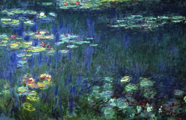
Irregular Lines (fig J) are used to create abstract forms and shapes, sometimes they represent a specific form and sometimes they just cause an impression. Vase with 12 sunflowers by Vincent van Gogh (fig J1) shows how irregular lines create abstract but specific forms. Water Lilies by Claude Monet (fig J2) shows how irregular lines create typical abstract impressions.

J1 J2

Crosshatching is the use of lines placed over one another in angles to create light and shadow, tone and shade in linear media. The technique is simple, shown in Crosshatching Tutorial (fig K) by Indefatigable42, shading from light to dark with parallel crossed lines. Both John Lennon in Crosshatching by ReAnim8or and Greek krater by Indefatigable42 show typical crosshatching techniques.

Friday, February 22, 2008

Elements of Design

The Elements of Design are visual elements and the basic structures used to create any work of art. They are also used to create the Principles of Design.
Because they are the language of the visual arts, any art, good or bad, has at least one element, if not all of them, at the same time.

Line (contour & crosshatching)
Direction (movement)
Shape (form)
Size
Colour
Value
Texture
Space