


The colors squeezed from the paint tube aren't that different from the basic colors you find in a Photoshop swatch. Today many people start digital painting in Photoshop without having any experience with traditional media, such as oil painting or acrylic, but the color concept is the same. If you are a traditional media artist you will understand how digital colors work and if you are a digital artist, you will understand where they come from.
In painting: oil, acrylic and digital, the 2 things you should know before anything else is the color wheel and the value scale, as well as complementary colors. If you understand them, you will know how to chose, mix and blend your colors. The only difference is that oil/acrylic paints usually have a name, and the names are mainly universal; and in Photoshop they have different names, but they are there.
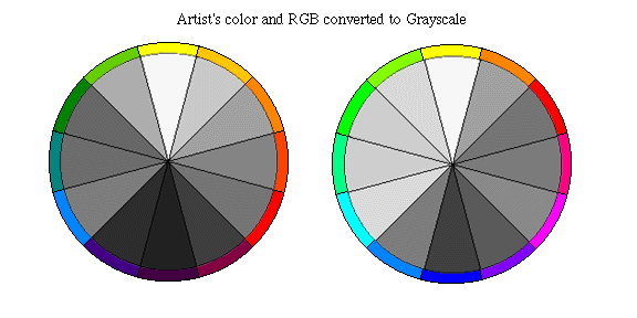
The colors are laid out in an even value gradation already, and in real life we can't have that unless you mix them. The value gradation or scale of the colors in Photoshop is diluted with black and white, which is mostly seen in Hue, Saturation and Brightness. The value gradation of the swatch has the white diluted colors first and becomes darker in a cycle until the darker values.

There are some colors that are basic for oil painting, to mix and blend all the others, such as: burned and raw sienna, cadmium red, cadmium/ochre yellow, permanent, chrome oxide and sap green, cerulian and untramarine blue, alizariam crimson, burnt and raw umber and payne's grey. The basic Photshop swatch, the one you see when you open Photoshop for the first time, or when you click reset swatches, has all of those colors. Raw and burnt umber, as well as the payne's grey are very diluted in white, but you can still see them.
In painting: oil, acrylic and digital, the 2 things you should know before anything else is the color wheel and the value scale, as well as complementary colors. If you understand them, you will know how to chose, mix and blend your colors. The only difference is that oil/acrylic paints usually have a name, and the names are mainly universal; and in Photoshop they have different names, but they are there.
The colors are laid out in an even value gradation already, and in real life we can't have that unless you mix them. The value gradation or scale of the colors in Photoshop is diluted with black and white, which is mostly seen in Hue, Saturation and Brightness. The value gradation of the swatch has the white diluted colors first and becomes darker in a cycle until the darker values.

There are some colors that are basic for oil painting, to mix and blend all the others, such as: burned and raw sienna, cadmium red, cadmium/ochre yellow, permanent, chrome oxide and sap green, cerulian and untramarine blue, alizariam crimson, burnt and raw umber and payne's grey. The basic Photshop swatch, the one you see when you open Photoshop for the first time, or when you click reset swatches, has all of those colors. Raw and burnt umber, as well as the payne's grey are very diluted in white, but you can still see them.
Inside the swatch you can see the real colors

The ideal raw umber, burnt umber and payne's gray would have to look like the ones below if you want to get as closer as possible of the traditional media color, like oil paint.


The ideal raw umber, burnt umber and payne's gray would have to look like the ones below if you want to get as closer as possible of the traditional media color, like oil paint.
Mixing the colors in the real world is different than mixing it in Photoshop. Physically, when we add layers of colors on top of each other, more light is absorbed and the color gets darker (browns and blacks). Digitally, because the monitor and the pixels emit light, they show less color, and because of that, digitally, too much color is too much light, or too bright (clears and whites).
Ideally, when creating digital art, all the adjustments on your work should be done very carefully at the end. This is a very hard thing to do but every time you adjust the image you lose color information, and you end up with an ugly purple hue around the edges of the subjects in your work. If you mess around too much with the same work of art you lose too much color. A way to fix this problem is to use adjustments layers, to avoid adjusting the image at the layer with the color.
Another important thing to know is how some colors behave digitally, such as: black, brown, green and dark blue. The digital black is "cool" because it is a true black, not like with oil paint, where the artist almost never uses real black, but uses a mix of ultramarine blue and burnt umber with different values for a warmer or cooler black. Whenever you blend images in Photoshop or mess around with contrast, you are adding more black and white to your work, and you end up losing color. Trying to do that at the end of your work or using adjustments layers is also good in this case. The digital pure brown is pretty much useless and really ugly. Mixing it with other colors to lay in tone and values works better. Digital green is stronger than real green. Adding red to it (works better in an adjustment layer) makes it less bright. Digital dark blue is very hard to blend with other colors. The best thing to do in this case is to either use a clearer blue or apply it on a different layer. Different digital brush sizes, shapes, opacity and flow blend colors differently.
I hope this little article helps some of you understand digital color, and maybe adventure in traditional media, which is also very cool.
Make sure you check this website! because it helps me a lot when I need to figure out a color swatch of digital art and traditional media too!
You can see this article in my gallery, and at dA news.
2 comments:
Wow! Such a wonderful blog. Thank you for sharing
Best Artclass in Town
Amazing blog. Keep up the good work
Portrait drawing for beginners | Freehand Face drawing
Post a Comment